
Retail interior design case study
Norther Power Garms store design
NORTHER POWER GARMS
Helena Harrison
9/2/20233 min read


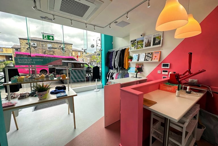
Bold interiors were certainly the order of the day when asked to design the new Northern Power Garms store in Yorkshire.
Design Development
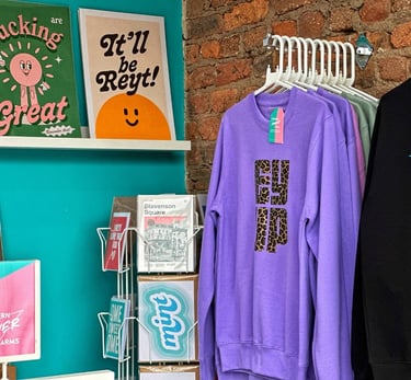
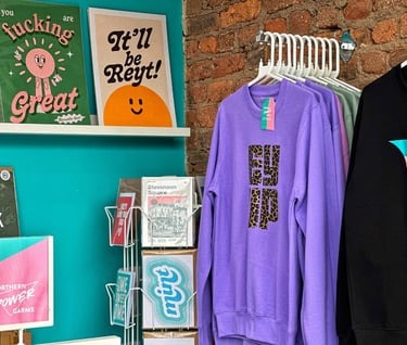
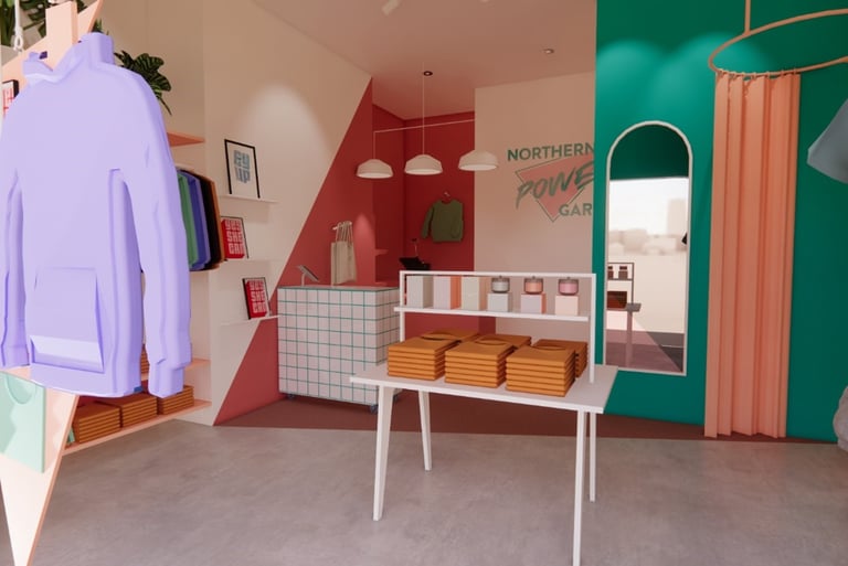
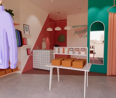
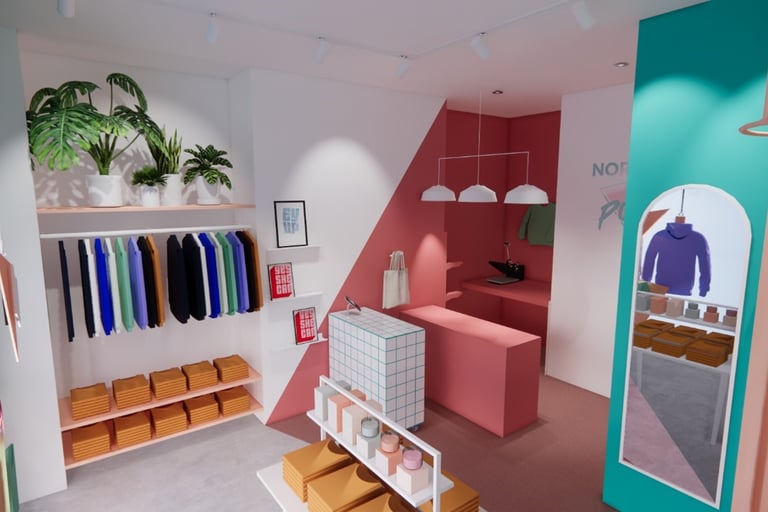
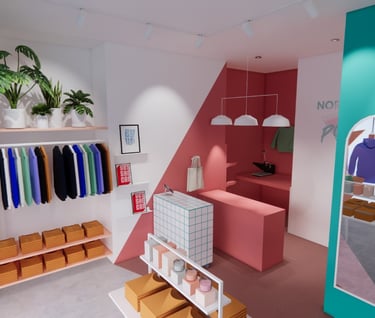
Working closely with the client I carefully considered how this workplace and retail outlet would perform. By theorising the use of the space and the product alongside ergonomics I made suggestions about specific areas should be designed to improve workflow, visual impact and hopefully as a result improve employee and shopper experience. For example I highlighted the need for front-facing rails to show off the eye-catching logos which are a signature stock item for this company.
The owner, Jules also expressed that she wanted to be able to use the back section of the shop as a work area for printing but didn’t want to block it off, this meant creating clear zoning that could be easily interpreted by the customer. A changing area was another aspect that the owner had not considered but something I felt would be valuable in a shop that predominately sold clothing. This was originally proposed on the shop floor to preserve workbench space but as things developed it was felt one of the stations could be waived and the curtain moved behind the wall.
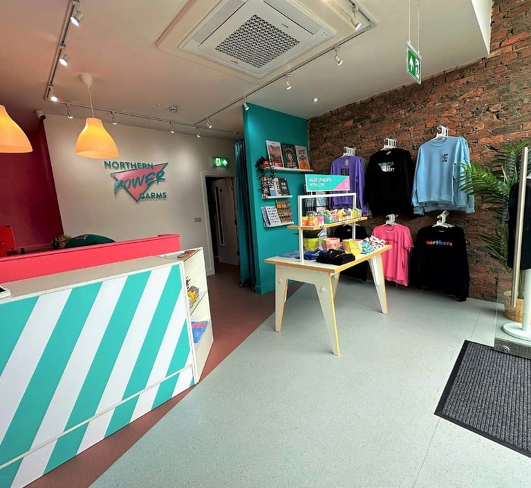
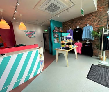
The triangular logo provided inspiration for many design features such as the split coloured flooring which was cut across at an angle, and a proposed suspended window display hanging boards allowing customers to see into the store without blocking the view but also providing an effective means of displaying product.
Interior Design Proposal
To make my ideas clear 3D visualisations of the space were created incorporating the design features. This allowed the client to get a clear sense of the intended design as well as an opportunity to test out various colour palettes and configurations without having to commence works.
In addition, creating the conceptual models gave Jules the chance to share some tangible proposals with her loyal followers and get excited about the new venture.
Sourcing
Then next stage was to finalise the design; ensuring that the client was completely happy with everything is imperative in any project. I spent quite a bit of time sourcing just the right shade of pink using trusted suppliers Crown Paints to ensure a high quality and durable finish in this high traffic commercial space. Track lighting was specified so that it was directional, showing off the stock to its full potential. Continuity in the colour of the furnishings and fixtures gave a slick finish. Thin lipped shelves display prints without dominating the space.
Collaboration
This project couldn’t have happened without collaboration. Starting with a solid and trusting relationship between client and designer and with the understanding and proficiency of reliable tradespeople
Meeting with the owner Jules, we chatted about her needs and what she envisaged for the store, she already had strong ideas about how she wanted to take things forward showing me a Pinterest board of ideas.
The brand’s Miami-style logo was to form the basis of the colour palette; a punchy teal and fuchsia pink. This was Beam Design’s first shop project so I delved deep into researching retail service schematics and candy colour styling.
Let's connect to discuss your design project today
Call or email to book an appointment:
For current updates on social media:
TEL: 07771348804
EMAIL: helena@beamdesign.co.uk
Address: